Accessibility in MOSS…

Recently I had a meeting with HiSoftware about the Accessibility Kit for SharePoint that they’ve made (and is available on CodePlex), and it was quite interesting. Making a SharePoint system accessible requires knowing how much of the system to make accessible, and to what level of accessibility. As with branding, doing the whole system would probably be prohibitively expensive. However, making certain areas (such as a WCM site) accessible is quite feasible.

Even if a SharePoint system is developed to be accessible, there is a governance issue in make sure that new content is also accessible. HiSoftware provide the Accessibility Kit (for free) to help develop an accessible site – though custom work will always be required. They also provide several commercial products to facilitate governance of new content and ensuring that it is accessible. I think that these will be useful sometimes, so it’s not a bad sales pitch. Continue reading “Accessibility in MOSS…”
Advertisement
Accessibility in MOSS…

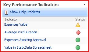
KPI Icons neatly designed for colour blindness

I was talking with one of our customers about SharePoint branding the other day. They’ve got some neat icons for displaying the status of things. However, the guy I was talking to wasn’t keen on them as they were the same colour (although their shape differs). This sort of led around to a discussion of the use of colour (or ‘color’) in web development.

One of my ‘neat tools to have around’ is the Color Contrast Analyzer (which I think you can get here -I must confess, I’m not sure who exactly wrote it or where exactly you’re supposed to get it from). This little tool lets you check the contrast of colour schemes so that your users will be able to use the site, even if they’re colour blind. Fair enough. The really exciting bit, though, is the ability to take screenshots and then simulate the different types of colour blindness.

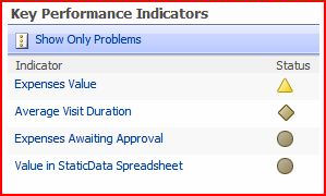
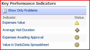
I used this to look at the SharePoint KPI icons. Similar icons to this are available in Excel 2007 for conditional formatting. I thought this was pretty interesting. For a start, it turns out that colour blindness is more complicated that just “red-green-blue” colour blindness, not least because the photoreceptors for the different colours overlap in their response to different frequencies of light. Still, this tool give a good view of the effects of the main conditions. For a full description, read this article at Wikipedia.

KPI - Normal
Normal
KPI - Greyscale
GreyScale
KPI - Deuteranopia (Red-Green Colour Blindness)
Deuteranopia (Red-Green Colour Blindness)
KPI - Protanopia (Different Form of Red-Green Colour Blindness)
Protanopia (Different Form of Red-Green Colour Blindness)
KPI - Tritanopia (Blue-Yellow Colour Blindness)
Tritanopia (Blue-Yellow Colour Blindness)

What this shows is pretty obvious – that the icons from red and green are pretty similar for red-green types of colour blindness (what a surprise), but that the shape of the icons still gives a good visual cue to the state of the KPI. Given that (according to Wikipedia) 7-10% of men are Red-green colour blind, this is important. It’s worth noting that women are very rarely colour blind, and that this probably explains my Dad’s dress sense and my Mum’s opinions on it…

KPI Icons neatly designed for colour blindness

Styling the Publishing Console in SharePoint

So, I’ve been asked to style up a SharePoint site, and I’ve come across a really stupid bit of code

The Publishing Console is the control for showing all the ‘edit page’, ‘check in’, ‘approve’, etc. functionality for publishing pages. You’ve gotta use it.

Complaint 1: It assumes that it’s going to be inside a table.

The control produces a table row – a <tr> . Hellooo? Anybody here of accessibility? Trying to avoid Tabled designs? Thanks guys, you’ve made that easy.

Complaint 2: Styling through JavaScript

So, the publishing control has these bits of padding at either end. Irritatingly, they’re hard to get rid of. They also position div tags below the table row that the console produces. This is shown on the right. So, what style contains the code for that? Um, none. That style is set in EditMenu.js, not in any style.

What bloody idiot decided to build such an inflexible, unstylable control, and did it in this way? There is no need for it to be done this way. I’ve now got to fight passed this, or write my own publishing console. Great. I’m happy with the out of box console, I just want to change it’s style a bit – creating a new control is excessive (though instructions are here).

Okay, slightly calmer edit – okay, yes, I can copy and change the Publishing Console itself – the file is straight forward enough – and hook it up as a delegate control. But I shouldn’t have to.

Success – I got rid of the end space. I realised that I could turn off display of the non-breaking spaces that hold the end padding open – and that annoying JavaScript doesn’t turn the visibility of the inner div tags back on!.ms-consoletitleareaframe, .ms-consoletitleareaframebottom
{
width:0px;
padding:0px;
margin: 0px;
background-color: #ffffff;
background-image: none;
display: none;
}

Styling the Publishing Console in SharePoint