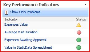
I was talking with one of our customers about SharePoint branding the other day. They’ve got some neat icons for displaying the status of things. However, the guy I was talking to wasn’t keen on them as they were the same colour (although their shape differs). This sort of led around to a discussion of the use of colour (or ‘color’) in web development.
One of my ‘neat tools to have around’ is the Color Contrast Analyzer (which I think you can get here -I must confess, I’m not sure who exactly wrote it or where exactly you’re supposed to get it from). This little tool lets you check the contrast of colour schemes so that your users will be able to use the site, even if they’re colour blind. Fair enough. The really exciting bit, though, is the ability to take screenshots and then simulate the different types of colour blindness.
I used this to look at the SharePoint KPI icons. Similar icons to this are available in Excel 2007 for conditional formatting. I thought this was pretty interesting. For a start, it turns out that colour blindness is more complicated that just “red-green-blue” colour blindness, not least because the photoreceptors for the different colours overlap in their response to different frequencies of light. Still, this tool give a good view of the effects of the main conditions. For a full description, read this article at Wikipedia.
 Normal |
 GreyScale |
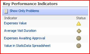 Deuteranopia (Red-Green Colour Blindness) |
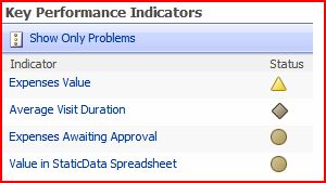 Protanopia (Different Form of Red-Green Colour Blindness) |
 Tritanopia (Blue-Yellow Colour Blindness) |
|
What this shows is pretty obvious – that the icons from red and green are pretty similar for red-green types of colour blindness (what a surprise), but that the shape of the icons still gives a good visual cue to the state of the KPI. Given that (according to Wikipedia) 7-10% of men are Red-green colour blind, this is important. It’s worth noting that women are very rarely colour blind, and that this probably explains my Dad’s dress sense and my Mum’s opinions on it…

[…] or images that have “alternate text” that screen-readers can read to blind people. Colour is also an important issue – you’ve got to make sure that a site will work for various different types of colour blindness. […]
Nice analysis using Contrast Analyser. Your findings, regarding the use of shape in addition to color in the icons, is an example of good practice as noted by Masataka Okabe and Kei Ito in their paper on making figures and presentations that are friendly to colorblind people. I have a pointer to it here:
http://colorvision.typepad.com/color_vision_store/2008/04/three-white-sci.html
-john
Yup, it’s interesting given how common colour blindness is how little attention is paid to it! Still, shape changes do appear to be a good cue – witness your mouse pointer, for example.
The really bizarre thing, though, is that the guy who does our prettiest web pages designs and graphics is himself colour blind. How he manages to do it so well mystifies me.